|
Lecture Notes
VIII. Market
Income
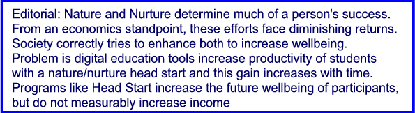
Does Not Measure of Well-being.
A. Many goods, especially since the digital
revolution,
provide more satisfaction than their cost indicates.
Income is thus understated.
Much of the value
provided by a smart phone was not
available 25 years ago and those that were each cost
thousand's of dollars. Movies that do not need
developing that will send anywhere in the
world didn't exist.
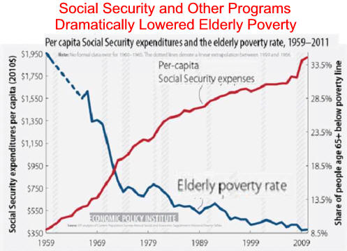
B. Government makes our lives better in
ways not measured
by market income. Curing childhood
disease and limiting
pollution are
just two economist's unmeasured item
C. Successful government fosters peace
allowing the
elimination of a peacetime draft.
D. Interesting Opinions
1. Conservative
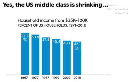
Is "Income Stagnation" a Myth?
2. Liberal View
Sad Story of Wages in Americans
3.
The Daily Show on Class Warfare
E. Child Safety is Not Measured but it increase of
well-being is
immeasurable. NYTimes.com
1. Physical abuse dropped 55% from 1992-2011
while
sexual abuse
dropped 64%.
2. Abduction by strangers dropped 52% from 1997
-2012.
F.
Social Progress Index ranks large industrialized
nations as good but below smaller rural more
northern nations.
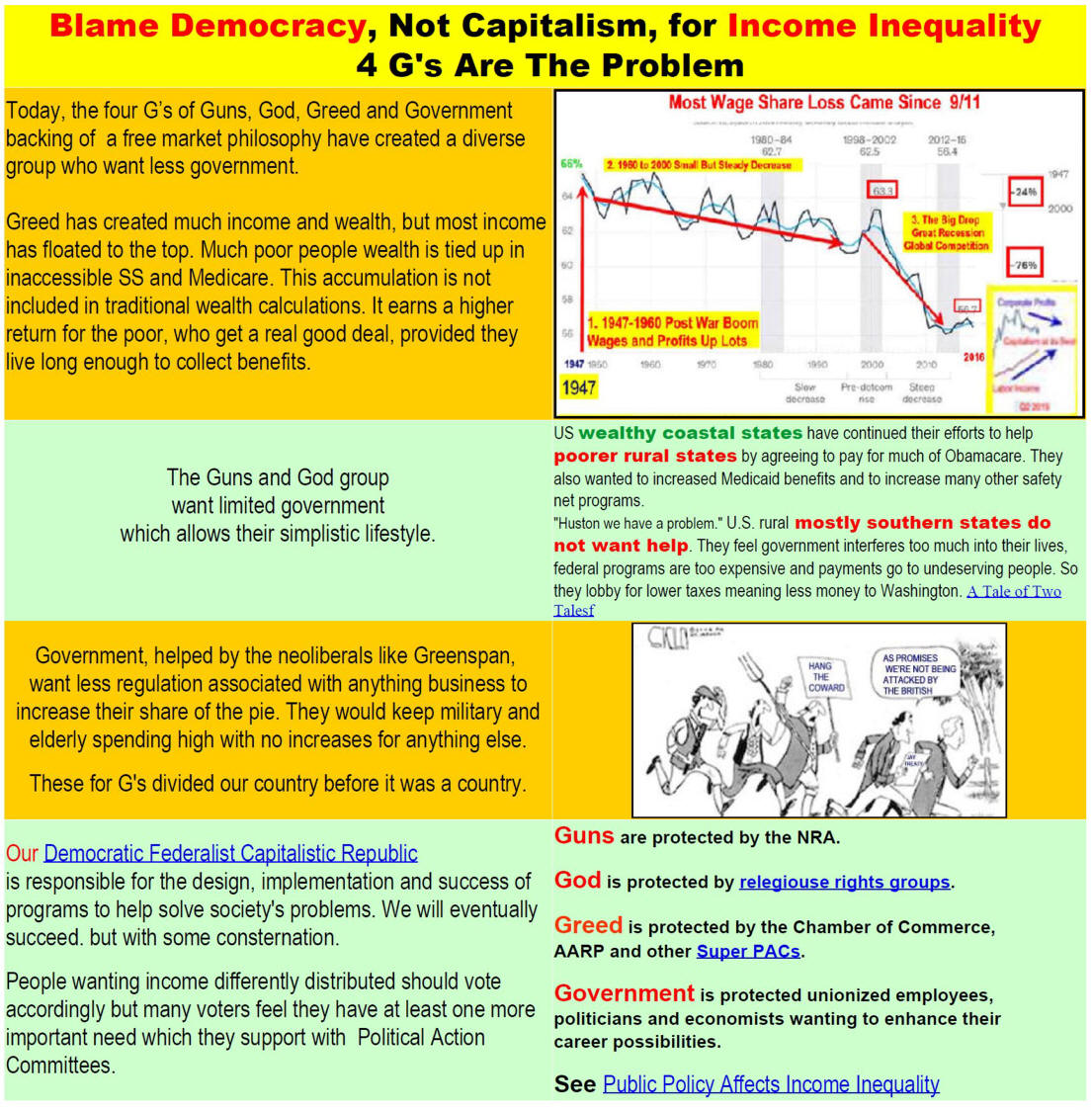
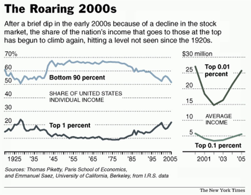
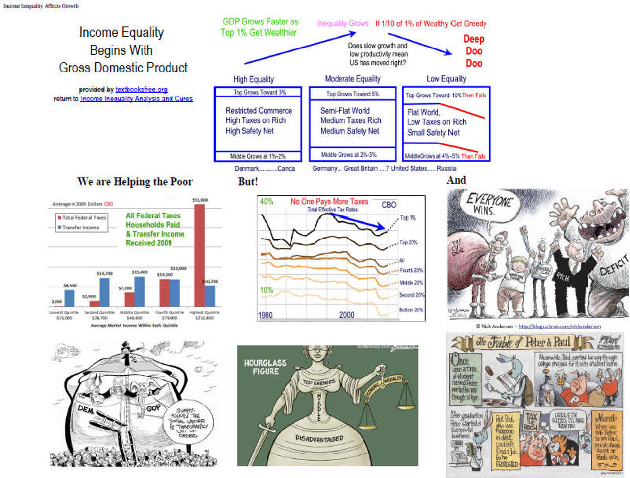
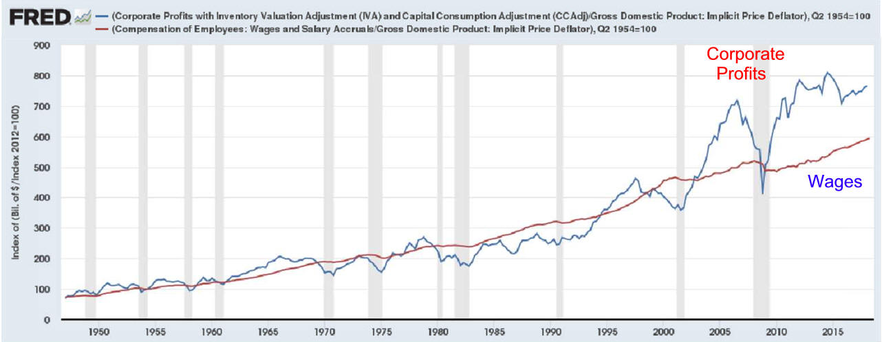
X.
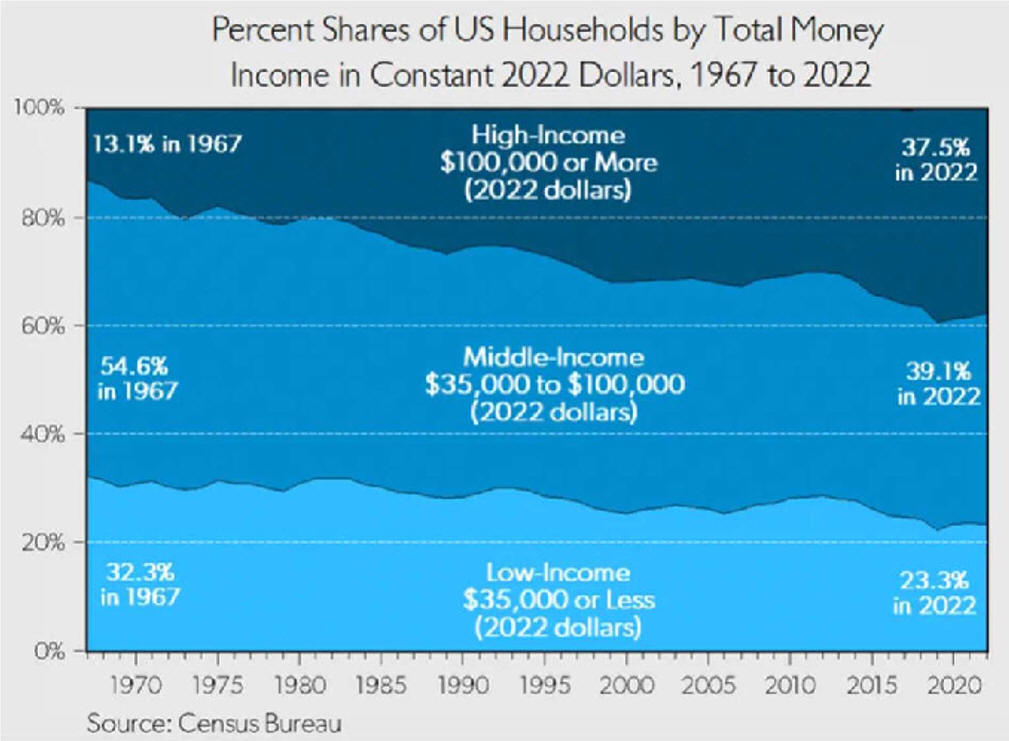
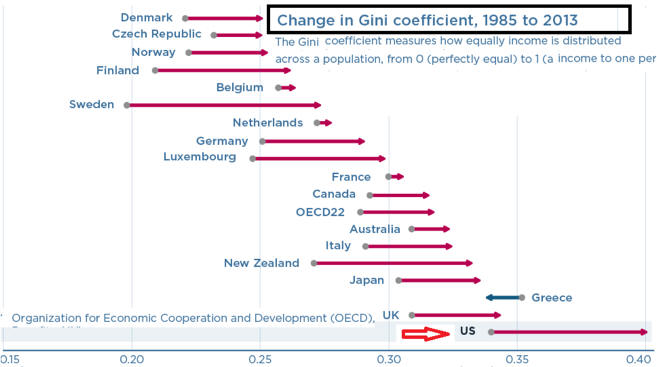
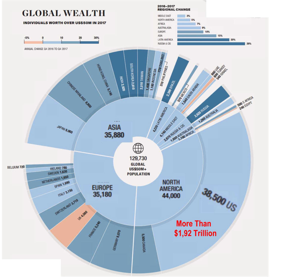
Income Inequality
Affects Growth
A. At some point,
Business
1. Takes Too Much
2. Growth Slows
3. Politics becomes unstable
B. Would a
Wealth
Tax slow growth?
Conservatives Say Yes
Liberals don't ask the
question. |
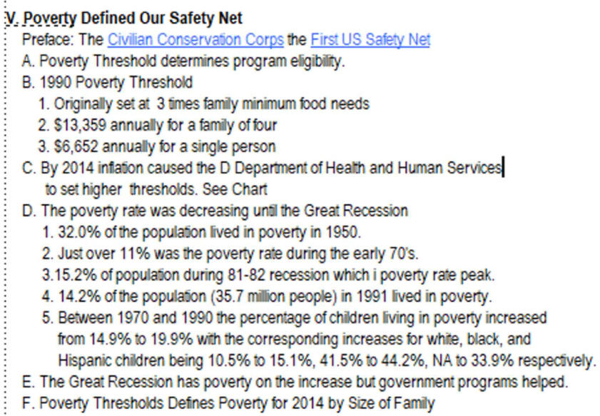
Supplemental
Political Economy
Stuff
Additional Information
1.
Income - Home
for census bureau data and reports.
2.
Millions live in extreme poverty here is how they get by
3.
Fight
Poverty in the U.S.
from save
the children
4.
The Bell Curve and Social Stability:
Shrink Wrapped Blog,
A Psychoanalyst Attempts to
Understand Our World
5. The Capitalism They Hate by Anthony
de Jasay
A. Part I
The Inequality Machine
B. Part II
Indecent Earnings
6.
Coming
Collapse of Middle Class - E. Warren UC Berkeley
7.
Americas-class-system-across-life-cycle has lots of data. 3/25/14
8.
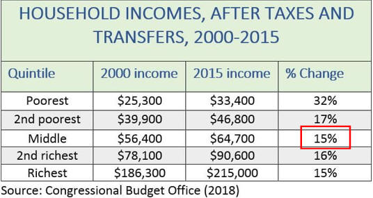
Income Inequality: A Question With No Easy Answer
9.
Second opinion of economic well-being of America's middle class.
Burkhauser, Jeff Larrimore, and Kosali I.
Simon, Nat. Tax Journal
This should be compared to the very poor
"analysis" discussed
yesterday (Manhattan Institute:
The Myth of Increasing Income Inequality by Diana Furchtgott-Roth).
In this
case a careful analysis reveals that such things as changes in
tax codes,
in-kind benefits (such as employer-provided health
insurance) and inclusion of
household make-up show less of an income
disadvantage for the middle class over
the last 30 years than simply
looking at pre-tax tax unit analysis. But there
still is a degradation,
not just as much. from
econintersection
See
Income Inequality Analysis and Cures
Election Issues 2016
Inequality and Economic Policy
Conversation with Mark Blyth: Economics and Social Justice |
|
X.
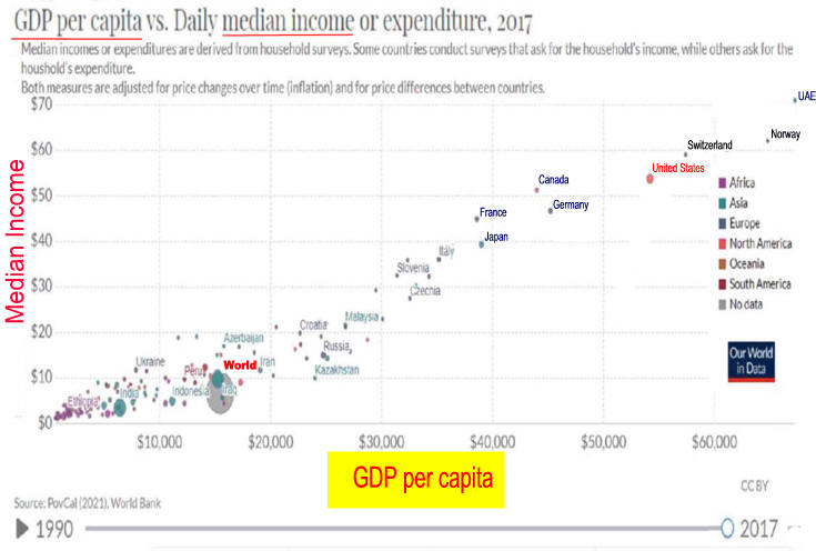
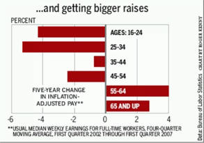
Are Americans Better Off than they were a Decade or Two-Ago
B. BernankeTable 1 confirms the conventional view that, broadly
measured, American living standards are comparable to those of the richest
Western European nations but much higher than living standards in
emerging-market economies. For example, this calculation puts economic
welfare in the United Kingdom at 97 percent of U.S. levels, but estimates
Mexican well-being at 22 percent. Interestingly, this comparison shows
Western European countries (like the U.K., France, and Italy) as
considerably closer to the U.S., in terms of economic welfare, than
differences in per capita income or consumption would suggest, reflecting
the fact that Western European countries do relatively well on the other
criteria considered (leisure, life expectancy, inequality). For emerging
and developing economies, however, differences in income or consumption
per person generally understate the advantage of the United
States, according to this measure, largely due to the greater levels of
inequality and lower life expectancies in those countries.

Table 2 shows that economic welfare improved at quite a rapid
pace over the two decades before the crisis (1995-2007), at more
than 3 percent per year, notably faster than the growth rate of per
capita GDP, at about 2 percent. [8]
As shown by the four rightmost columns of Table 2 and, graphically,
in Figure 1, the gains in welfare were driven primarily by increases
in per capita consumption and by improvements in life expectancy,
which rose by 2.3 years over the period, from 75.8 to 78.1 years.
Rising consumption inequality subtracted between 0.1 and 0.2
percentage points from the annualized growth rate in welfare during
the pre-crisis period, and changes in leisure/work hours per person
(which were stable) made only a very small contribution.

|
Cato Institute's 2018
Agrees
|
|
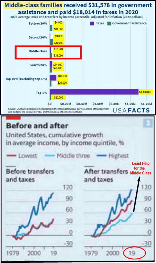
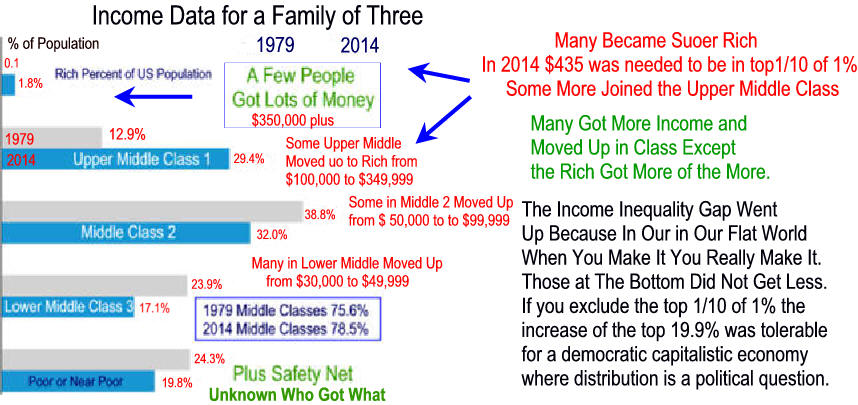
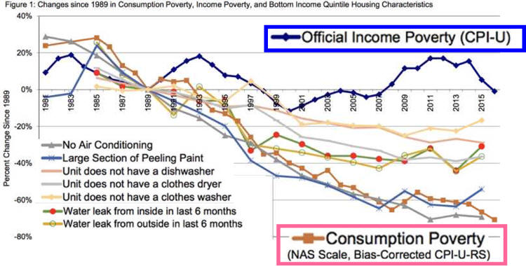
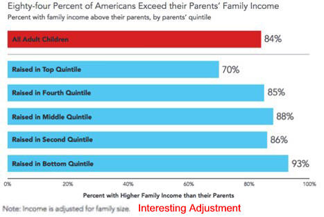
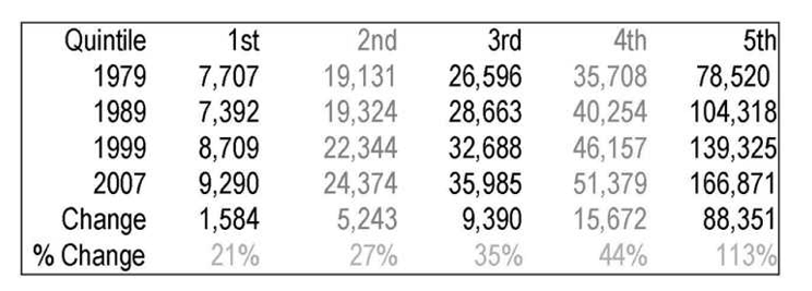
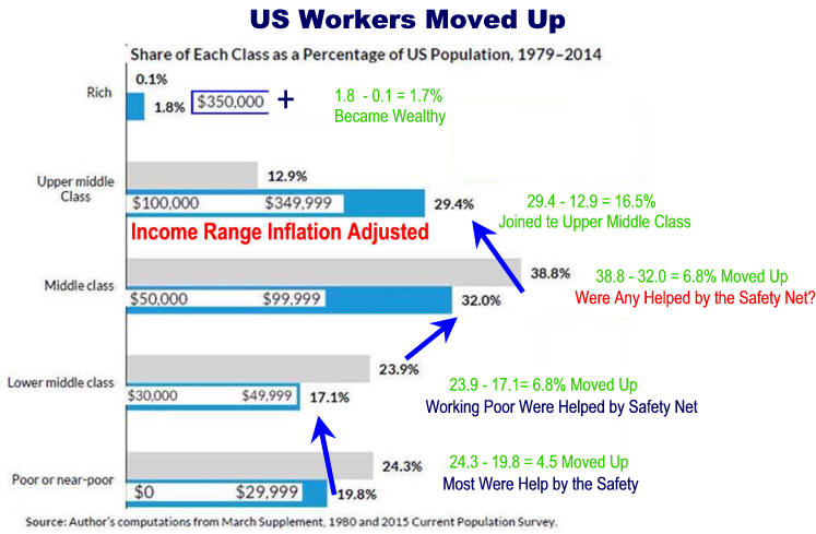
Reassessing the Facts Inequality, Poverty, and
Redistribution
Income Adjusted for
Governments
Bottom quintile earnings share
rose from 2.2% to 12.9%
Second quintile share rose from
7% 13.9%
Third
quintile middle-income quintile rose
from 12.6% to only 15.4%
Fourth quintile�s share
fell
from 20.5% to 18.6%
Top
quintile share fell from 57.7% to 39.3%.
Top to bottom multiple
dropped
from 26 times to three times
In addition work effort increased moving up the income ladder as
more family members worked and more worked two jobs.
Calculations
|
Author's
editorial! from when he started this project.
A September 3,
1992 Wall Street Journal editorial by Robert Rector,
a policy analyst
for the Heritage Foundation in Washington, D.C.,
reported the following concerning 1990 government spending on
poverty:
"Out of a total
of $184 billion in welfare spending..."
"...Census counted only $32.5 billion as income."
This means that the actual income of those living in poverty is substantially
understated.
It is difficult to lower the number of
people living on poverty income
if much of the money given them
does not count as income!
Editors Note: In
2015 people still see the poverty percent and assume x percent
are starving when most are receiving food stamps, subsidized lunches ...
Approximate per capita understatement
would be calculated as follows:
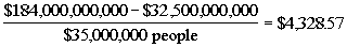
Administrative costs must be subtracted therefore not all of
the $4,328.57
per person was not given in direct aid.
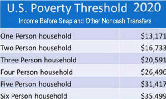
Editor's Note: It has been 25 years since
this analysis and still in 2017 most people do not realize
that the U.S. Government publish poverty rate is before noncash
transfers like SNAP (food stamps).
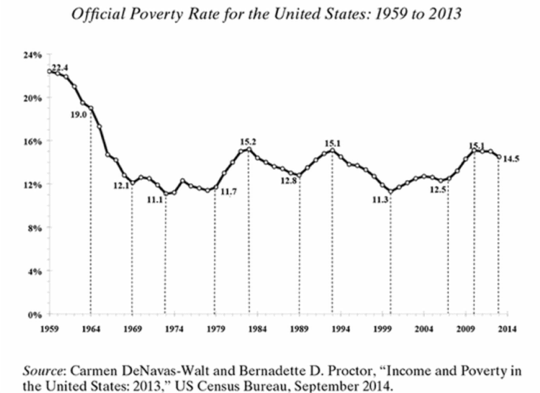
One Columnist used the rate during the Great Recession to report 50
million mostly children were starving.
"Stupid is as stupid does."
|